DLIFLC Harmony Design System
Overview
The Defense Language Institute Foreign Language Center Brand Guide was developed to ensure a shared visual experience that reinforces DLIFLC’s identity and the core priorities that are the key elements of the brand.
The foundation of the institute's brand is the DLIFLC Mission Statement:
The DLIFLC mission is to provide the highest quality culturally based foreign language education, training and evaluation to enhance the national security of the United States; and, as an Associate of Arts Degree and certificate granting Institution, DLIFLC is wholly committed to student service member success.
Harmony's Objective
The purpose of this guide is to ensure that no matter how people engage with the DLIFLC – on the website, via email or U.S. mail, through social media, livestream broadcasts or photographs – they are left with an impression that accurately reflects the institute’s brand identity, mission and values.
Values
Commitment
We are committed to our students, employees, stakeholders, life-long learning and institutional excellence.
Adaptability
We promote flexibility and drive innovative change as individuals and as an institution.
Integrity
We expect personal and professional integrity.
Respect
We honor our cultural and social diversity by treating others with dignity and respect.
The Institute shares the DLIFLC story daily through official statements and a variety of informational products, engaging with many audiences around the world. Communicators should refer to this guide for correct use of the DLIFLC brand in all communications from inception to production and delivery, in all media.
Theme Color Choices
Color palette based on options below. Click to select theme to then view how theme colors are applied to the components.
#470A68
rgba(71, 10, 104, .9)
#3478BD
rgba(52, 120, 189, .9)
#115E67
rgba(17, 94, 103, .9)
#6AAEAA
rgba(106, 174, 170, .9)
#789D4A
rgba(120, 157, 74, .9)
#ED8B00
rgba(237, 139, 0, .9)
#D35E13
rgb(211, 94, 19, .9)
#171717
rgba(71, 10, 104, .9)
Functions and Interactions
<body class="dliflc-purple"> or <body class="primary">
<body class="gloss-blue">
<body class="dliflc-teal">
<body class="grotto-blue">
<body class="mintleaf">
<body class="dliflc-orange">
<body class="hs2-orange">
Typography
Paragraph Styles
Normal Body and Paragraph - (Open Sans @ 16px)html, body, p, p.normal
Lorem Ipsum is simply dummy text of the printing and typesetting industry. Lorem Ipsum has been the industry's standard dummy text ever since the 1500s.
Large Paragraph - (Open Sans @ 19px)p.large
Lorem Ipsum is simply dummy text of the printing and typesetting industry. Lorem Ipsum has been the industry's standard dummy text ever since the 1500s.
Reduced Paragraph - (Open Sans @ 14px)p.reduced
Lorem Ipsum is simply dummy text of the printing and typesetting industry. Lorem Ipsum has been the industry's standard dummy text ever since the 1500s.
X-Small Paragraph - (Open Sans @ 12px)p.xsmall
Lorem Ipsum is simply dummy text of the printing and typesetting industry. Lorem Ipsum has been the industry's standard dummy text ever since the 1500s.
Heading Styles
Headlines H1(Open Sans @ 2.4em)h1, .h1
Headline 1 (default)
Headline 1 - .light
Headline 1 - .text-primary
Headline 1 - .text-gray
Headlines H2(Open Sans @ 1.9em)h2, .h2
Headline 2 (default)
Headline 2 - .text-primary
Headline 2 - .text-gray
Headlines H3(Open Sans @ 1.5em)h3, .h3
Headline 3 (default)
Headlines H4(Open Sans @ 1.3em)h4, .h4
Headline 4 (default)
Headlines H5(Open Sans @ 1.2em)h5, .h5
Headline 5 (default)
Headlines H6(Open Sans @ 1em)h6, .h6
Headline 6 (default)
Styled & Special Typography
Bold text(Open Sans:700)b, strong, .strong
Bold text.
Subtitle 1(Open Sans @ 18px).subtitle-1
Subtitle 1
Subtitle 2(Open Sans @ 14px).subtitle-2
Subtitle 2
Bullet List.bullet
- Because we use more non-bullet lists than with bullets, we use "list-style-type:none" as default.
- Add class ".bullet" to <ul> to revert and display "list-style-type:disc".
Caption(Open Sans @ 12px).caption
Caption
Overline(Open Sans @ 10px).overline
Overline
News Heading(Crimson Text @ 27px/18px).news
News Heading
News copy
Functions and Interactions
<!-- Body and paragraphs -->
<p>Normal body and paragraph</p>
<p class="large">Large paragraph</p>
<p class="reduced">Reduced paragraph</p>
<p class="xsmall">X-Small paragraph</p>

<!-- Special Typography -->
<p class="strong">Bold text.</p>
<p class="subtitle-1">Subtitle 1</p>
<p class="subtitle-2">Subtitle 2</p>
<ul>
	<li>DEFAULT BULLET LIST - NO CLASS</li>
	<li>Default bullet list is without bullet symbol</li>
</ul>
<ul class="bullet">
	<li>Because we use more non-bullet lists than with bullets, we use "list-style-type:none" as default.</li>
	<li>Add class ".bullet" to <ul> to revert and display "list-style-type:disc".</li>
</ul>
<p class="caption">Caption</p>
<p class="overline">Overline</p>
<p class="h4 news">News Heading</p>
<p class="news">News copy</p>

<!-- Headings -->
<h1>Headline 1 (Default)</h1>
<h1 class="light">Headline 1 (light)</h1>
<h1 class="text-primary">Headline 1 (text-primary)</h1>
<h1 class="text-gray">Headline 1 (text-gray)</h1>

<h2>Headline 2 (Default)</h2>
<h2 class="text-primary">Headline 2 (text-primary)</h2>
<h2 class="text-gray">Headline 2 (text-gray)</h2>

<h3>Headline 3 (Default)</h3>

<h4>Headline 4 (Default)</h4>

<h5>Headline 5 (Default)</h5>

<h6>Headline 6 (Default)</h6>

<!-- Special Styles & Typography -->
<p class="strong">Bold text</p>
<p class="subtitle-1">Subtitle 1</p>
<p class="subtitle-2">Subtitle 2</p>
<p class="caption">Caption</p>
<p class="overline">Overline</p>
<p class="news">News Heading</p>
Official DLIFLC Branding Colors
Primary Color Palette
#470A68
rgba(71, 10, 104, .9)
#333333
rgba(51, 51, 51, .9)
#FFFFFF
rgba(255, 255, 255, .9)
Alt Color Palette
#115E67
rgba(17, 94, 103, .9)
#6AAEAA
rgba(106, 174, 170, .9)
#F7F7F7
rgba(247, 247, 247, .9)
#F2F2F2
rgba(242, 242, 242, .9)
#E5E5E5
rgba(229, 229, 229, .9)
#808080
rgba(128, 128, 128, .9)
#4D4D4D
rgba(77, 77, 77, .9)
#1A1A1A
rgba(26, 26, 26, .9)
Tertiary Color Palette
#5F259F
rgba(95, 37, 159, .9)
#789D4A
rgba(120, 157, 74, .9)
#4A773C
rgba(74, 119, 60, .9)
#F6BE00
rgba(246, 190, 0, .9)
#F2A900
rgba(242, 169, 0, .9)
#ED8B00
rgba(237, 139, 0, .9)
#BA0020
rgba(186, 0, 32, .9)
#3478BD
rgba(52, 120, 189, .9)
#11747F
rgba(17, 116, 127, .9)
#00AFA9
rgba(0, 175, 169, .9)
#B49D80
rgba(180, 157, 128, .9)
#D35E13
rgb(211, 94, 19, .9)
#445464
rgb(68, 84, 100, .9)
Starter Templates
Copy one of the templates below to use as a layout starting point.
Wide Template(Full width, no sidebar navigation)
<!DOCTYPE html>
<html lang="en">
    <head>
        <meta charset="utf-8">
        <meta http-equiv="X-UA-Compatible" content="IE=edge">
        <meta name="viewport" content="width=device-width, initial-scale=1, minimum-scale=1.0, maximum-scale=5.0">
        <title>{SITE NAME}</title>

    <!-------  FOR .NET 4.8 IMPLEMENTATIONS - Add to Template - Else DELETE THIS SECTION!  ------->
        @{
            var HarmonyURL = System.Configuration.ConfigurationManager.AppSettings["HarmonyURL"];
        }

    <!-------  FOR .NET 8 IMPLEMENTATIONS - Add to Template - Else DELETE THIS SECTION!  ------->
        @inject IConfiguration _config
        @{
            var HarmonyURL = _config["HarmonyUI:HarmonyURL"];
        }

    <!-------  Harmony UI Toolkit Assets     ---------------------------------------->
        <!-- URL Variable below will resolve by combining .NET snippet above with config variables for site environments on server. -->
        <link rel="icon" type="image/x-icon" href="@HarmonyURL/dliflc-theme/assets/img/favicon.png">
        <link rel="stylesheet" type="text/css" href="@HarmonyURL/css/theme.css" />
        <script type="text/javascript" src="@HarmonyURL/js/main.js"></script>
    <!----------------------------------------------------------------------------->
    </head>
    <body id="@Regex.Replace(ViewBag.Title, @"\s+", "")" class="@ViewBag.BodyClass no-sidebar-template wide-nav">
        <header id="global_nav_wrapper">
            <nav id="global_nav" class="navbar navbar-expand-md">
                <a class="global-nav-title m-auto m-md-0" href="#">
                    <span class="d-none d-md-block">APP NAME</span>
                </a>
                <!-- global navigation menus -->
                <button class="navbar-toggler collapsed" type="button" data-bs-toggle="collapse" data-bs-target="#global_nav_menu_demo" aria-controls="global_nav_menu_demo" aria-expanded="false" aria-label="Toggle navigation">
                    <span class="toggler-menu-icon toggler-menu-icon-top"></span>
                    <span class="toggler-menu-icon toggler-menu-icon-bottom"></span>
                </button>
                <div id="global_nav_menu_demo" class="global_nav_menu collapse navbar-collapse justify-content-end">
                    <ul class="navbar-nav mt-3 mb-4 ml-auto my-md-auto">
                        <li class="nav-item">
                            <a class="nav-link" href="#">Link-1</a>
                        </li>
                        <li class="nav-item">
                            <a class="nav-link" href="#">Link-2</a>
                        </li>
                        <li class="nav-item">
                            <a class="nav-link" href="#">Link-3</a>
                        </li>
                    </ul>
                </div>
                <!-- global navigation buttons -->
                <div class="global-nav-btn-wrapper">
                    <!-- global nav signin panel -->
                    <div class="dropdown">
                        <div id="global_nav_signin" class="global-nav-btn" data-bs-toggle="dropdown" aria-expanded="false"></div>
                        <div class="dropdown-menu dropdown-menu-end" aria-labelledby="dropdownMenuButton">
                                <div class="dropdown-item" href="#">User Name</div>
                                <div class="dropdown-divider"></div>
                                <div class="dropdown-item" href="#">Sign Out</div>
                        </div>
                    </div>
                </div>
            </nav>
        </header>
        <main class="container-fluid main-content">
            <div class="row g-5 w-100">
                <div class="col-md-2 mt-0 pe-0 ps-1 box-shadow-1">
                    <div data-component="sidebar" class="sidebar">
                        <ul class="sidebar-list-group">
                            <li class="parent-item"><button id="homeBtn" class="btn-link">Home</button></li>
                            <li class="parent-item has-sublist"><button class="btn-link">TopLevelLink 1</button>
                                <ul class="sub-list">
                                    <li class="sub-item"><button class="btn-link">SubLink 1-1</button></li>
                                    <li class="sub-item"><button class="btn-link">SubLink 1-2</button></li>
                                    <li class="sub-item"><button class="btn-link">SubLink 1-3</button></li>
                                </ul>
                            </li>
                            <li class="parent-item has-sublist"><button class="btn-link">TopLevelLink 2</button>
                                <ul class="sub-list">
                                    <li class="sub-item"><button class="btn-link">SubLink 2-1</button></li>
                                    <li class="sub-item"><button class="btn-link">SubLink 2-2</button></li>
                                    <li class="sub-item"><button class="btn-link">SubLink 2-3</button></li>
                                </ul>
                            </li>
                            <li class="parent-item has-sublist"><button class="btn-link">TopLevelLink 3</button>
                                <ul class="sub-list">
                                    <li class="sub-item"><button class="btn-link">SubLink 3-1</button></li>
                                    <li class="sub-item"><button class="btn-link">SubLink 3-2</button></li>
                                    <li class="sub-item"><button class="btn-link">SubLink 3-3</button></li>
                                </ul>
                            </li>
                        </ul>
                    </div>
                </div>
                <div class="col-md-10">
                    Main content goes here...
                </div>
            </div>
        </main>
        <footer class="container-fluid py-4 global-footer mt-5">
            <div class="dliflc-full-width-padding m-auto small">
                    <div class="col px-0">
                            <div class="row justify-content-between">
                                    <div class="footer-copyright col-auto pl-0 mx-auto mx-lg-0">1759 Lewis Rd. - Presidio of Monterey - Monterey, CA 93944</div>
                                    <div class="footer-link col-auto mx-auto mx-lg-0">
                                            <a href="tel:8312425119" title="Call DLIFLC">(831) 242-5119</a><span class="xsmall dsn">(DSN-768)</span>
                                    </div>
                            </div>
                    </div>
                    <hr class="my-2">
                    <div class="col px-0">
                            <div class="row justify-content-between">
                                    <div class="footer-copyright col-auto pl-0 mx-auto mx-lg-0">© Defense Language Institute Foreign Language Center - 2024</div>
                                    <div class="footer-link col-auto px-0 mx-auto mx-lg-0 text-center">
                                            <a href="index.html">Design</a><span class="horizontal-divider">|</span>
                                            <a href="implementation.html" class="">Implement</a><span class="horizontal-divider">
                                    </span></div>
                            </div>
                    </div>
            </div>
        </footer>
    </body>
</html>
Sidebar Nav Template(With sidebar navigation)
<!DOCTYPE html>
<html lang="en">
    <head>
        <meta charset="utf-8">
        <meta http-equiv="X-UA-Compatible" content="IE=edge">
        <meta name="viewport" content="width=device-width, initial-scale=1, minimum-scale=1.0, maximum-scale=5.0">
        <title>{SITE NAME}</title>

    <!-------  FOR .NET 4.8 IMPLEMENTATIONS - Add to Template - Else DELETE THIS SECTION!  ------->
        @{
            var HarmonyURL = System.Configuration.ConfigurationManager.AppSettings["HarmonyURL"];
        }

    <!-------  FOR .NET 8 IMPLEMENTATIONS - Add to Template - Else DELETE THIS SECTION!  ------->
        @inject IConfiguration _config
        @{
            var HarmonyURL = _config["HarmonyUI:HarmonyURL"];
        }

    <!-------  Harmony UI Toolkit Assets     ---------------------------------------->
        <!-- URL Variable below will resolve by combining .NET snippet above with config variables for site environments on server. -->
        <link rel="icon" type="image/x-icon" href="@HarmonyURL/dliflc-theme/assets/img/favicon.png">
        <link rel="stylesheet" type="text/css" href="@HarmonyURL/css/theme.css" />
        <script type="text/javascript" src="@HarmonyURL/js/main.js"></script>
    <!----------------------------------------------------------------------------->
    </head>
    <body id="@Regex.Replace(ViewBag.Title, @"\s+", "")" class="@ViewBag.BodyClass sidebar-template wide-nav">
        <header id="global_nav_wrapper">
            <nav id="global_nav" class="navbar navbar-expand-md">
                <a class="global-nav-title m-auto m-md-0" href="#">
                    <span class="d-none d-md-block">APP NAME</span>
                </a>
                <!-- global navigation menus -->
                <button class="navbar-toggler collapsed" type="button" data-bs-toggle="collapse" data-bs-target="#global_nav_menu_demo" aria-controls="global_nav_menu_demo" aria-expanded="false" aria-label="Toggle navigation">
                    <span class="toggler-menu-icon toggler-menu-icon-top"></span>
                    <span class="toggler-menu-icon toggler-menu-icon-bottom"></span>
                </button>
                <div id="global_nav_menu_demo" class="global_nav_menu collapse navbar-collapse justify-content-end">
                    <ul class="navbar-nav mt-3 mb-4 ml-auto my-md-auto">
                        <li class="nav-item">
                            <a class="nav-link" href="#">Link-1</a>
                        </li>
                        <li class="nav-item">
                            <a class="nav-link" href="#">Link-2</a>
                        </li>
                        <li class="nav-item">
                            <a class="nav-link" href="#">Link-3</a>
                        </li>
                    </ul>
                </div>
                <!-- global navigation buttons -->
                <div class="global-nav-btn-wrapper">
                    <!-- global nav signin panel -->
                    <div class="dropdown">
                        <div id="global_nav_signin" class="global-nav-btn" data-bs-toggle="dropdown" aria-expanded="false"></div>
                        <div class="dropdown-menu dropdown-menu-end" aria-labelledby="dropdownMenuButton">
                                <div class="dropdown-item" href="#">User Name</div>
                                <div class="dropdown-divider"></div>
                                <div class="dropdown-item" href="#">Sign Out</div>
                        </div>
                    </div>
                </div>
            </nav>
        </header>
        <main class="container-fluid main-content">
            <div class="row g-5 w-100">
                <div class="col-md-2 mt-0 pe-0 ps-1 box-shadow-1">
                    <div data-component="sidebar" class="sidebar">
                        <ul class="sidebar-list-group">
                            <li class="parent-item"><button id="homeBtn" class="btn-link">Home</button></li>
                            <li class="parent-item has-sublist"><button class="btn-link">TopLevelLink 1</button>
                                <ul class="sub-list">
                                    <li class="sub-item"><button class="btn-link">SubLink 1-1</button></li>
                                    <li class="sub-item"><button class="btn-link">SubLink 1-2</button></li>
                                    <li class="sub-item"><button class="btn-link">SubLink 1-3</button></li>
                                </ul>
                            </li>
                            <li class="parent-item has-sublist"><button class="btn-link">TopLevelLink 2</button>
                                <ul class="sub-list">
                                    <li class="sub-item"><button class="btn-link">SubLink 2-1</button></li>
                                    <li class="sub-item"><button class="btn-link">SubLink 2-2</button></li>
                                    <li class="sub-item"><button class="btn-link">SubLink 2-3</button></li>
                                </ul>
                            </li>
                            <li class="parent-item has-sublist"><button class="btn-link">TopLevelLink 3</button>
                                <ul class="sub-list">
                                    <li class="sub-item"><button class="btn-link">SubLink 3-1</button></li>
                                    <li class="sub-item"><button class="btn-link">SubLink 3-2</button></li>
                                    <li class="sub-item"><button class="btn-link">SubLink 3-3</button></li>
                                </ul>
                            </li>
                        </ul>
                    </div>
                </div>
                <div class="col-md-10">
                    Main content goes here...
                </div>
            </div>
        </main>
        <footer class="container-fluid py-4 global-footer mt-5">
            <div class="dliflc-full-width-padding m-auto small">
                    <div class="col px-0">
                            <div class="row justify-content-between">
                                    <div class="footer-copyright col-auto pl-0 mx-auto mx-lg-0">1759 Lewis Rd. - Presidio of Monterey - Monterey, CA 93944</div>
                                    <div class="footer-link col-auto mx-auto mx-lg-0">
                                            <a href="tel:8312425119" title="Call DLIFLC">(831) 242-5119</a><span class="xsmall dsn">(DSN-768)</span>
                                    </div>
                            </div>
                    </div>
                    <hr class="my-2">
                    <div class="col px-0">
                            <div class="row justify-content-between">
                                    <div class="footer-copyright col-auto pl-0 mx-auto mx-lg-0">© Defense Language Institute Foreign Language Center - 2024</div>
                                    <div class="footer-link col-auto px-0 mx-auto mx-lg-0 text-center">
                                            <a href="index.html">Design</a><span class="horizontal-divider">|</span>
                                            <a href="implementation.html" class="">Implement</a><span class="horizontal-divider">
                                    </span></div>
                            </div>
                    </div>
            </div>
        </footer>
    </body>
</html>
Layout Grids
Examples
1400px (no padding).row.dliflc-full-width
- Modifier class to add to outer structural ".rows"
- Removes padding of row to allow true 100% of it's parent's width.
- Use for outer wrapping ".rows" that contain additional ".col" or ".col > .row > .col"... sequences.
- Good for getting things fully aligned on left if immediate children are higher level structural wrapper columns
- Removes padding of row to allow true 100% of it's parent's width.
- Use for outer wrapping ".rows" that contain additional ".col" or ".col > .row > .col"... sequences.
1400px + 22px padding.dliflc-full-width-padding
Small and large screens triggers.col-num .col-md-num
Rows containing 0 margin inner columns.row.row-negative-offset
Functions and Interactions
<div class="dliflc-full-width row">
    <div class="col-12">1024px</div>
</div>
<div class="dliflc-full-width-padding row">
    <div class="col-12">980px = 1024px - (22px x 2px)</div>
</div>
<div class="dliflc-full-width-padding row">
    <div class="col-4">.col-4 (33.3%)</div>
    <div class="col-4">.col-4 (33.3%)</div>
    <div class="col-4">.col-4 (33.3%)</div>
</div>
<div class="dliflc-full-width-padding row">
    <div class="col-12 col-md-6">.col-12 .col-md-6 (small 100%, large 50%)</div>
    <div class="col-12 col-md-6">.col-12 .col-md-6 (small 100%, large 50%)</div>
</div>
<div class="dliflc-full-width-padding row row-negative-offset">
    <div class="col-12 col-md-6">.col-6</div>
    <div class="col-12 col-md-6">.col-6</div>
</div>
BG Colors
Examples
Background Colors Add class names shown in examples for easy background styling
Functions and Interactions
<div class="bg-dark">{content}</div>
<div class="bg-primary">{content}</div>
<div class="bg-info">{content}</div>
<div class="bg-success">{content}</div>
<div class="bg-warning">{content}</div>
<div class="bg-orange">{content}</div>
<div class="bg-danger">{content}</div>
<div class="bg-light">{content}</div>
<div class="bg-white">{content}</div>
Borders
Examples
Default - 1px solid border with 4px border radius
Optional modifiers for width available by adding .border-1 ... .border-5 to colored border classnames
Functions and Interactions
<div class="border-primary">{content}</div>
<div class="border-alt">{content}</div>
<div class="border-success">{content}</div>
<div class="border-danger">{content}</div>
<div class="border-warning">{content}</div>
<div class="border-info">{content}</div>
<div class="border-light">{content}</div>
<div class="border-dark">{content}</div>
<div class="border-white">{content}</div>

<div class="border-1 border-success">{content}</div>
<div class="border-2 border-success">{content}</div>
<div class="border-3 border-success">{content}</div>
<div class="border-4 border-success">{content}</div>
<div class="border-5 border-success">{content}</div>
Box Shadow
Examples
Box Shadow Option 1 (Soft Shadow)
Box Shadow Option 2 (Darker Shadow)
Functions and Interactions
<div class="box-shadow-1">.box-shadow-1</div>
<div class="box-shadow-2">.box-shadow-2</div>
HR Tag and Dividers
Examples
Full width divider element<hr />
Horizontal divider.horizontal-divider
Functions and Interactions
Horizontal Rule
    <hr />

Horizontal Dividers
<div>Link<span class="horizontal-divider">|</span>Link<span class="horizontal-divider">|</span>Link</div>
Header
Examples
Global Nav Dark (Default)header #global_nav_wrapper
Global Nav Lightheader #global_nav_wrapper.navlite
Local Navheader #local_nav_wrapper
Functions and Interactions
<!-- Default (Dark) Global Nav -->
<header id="global_nav_wrapper">
  <nav id="global_nav" class="navbar navbar-expand-md">
    <a class="global-nav-title m-auto m-md-0" href="#">
      <span class="d-none d-md-block">DLIFLC</span>
    </a>
    <!-- global navigation menus -->
    <button class="navbar-toggler collapsed" type="button" data-bs-toggle="collapse" data-bs-target="#global_nav_menu_demo" aria-controls="global_nav_menu_demo" aria-expanded="false" aria-label="Toggle navigation">
      <span class="toggler-menu-icon toggler-menu-icon-top"></span>
      <span class="toggler-menu-icon toggler-menu-icon-bottom"></span>
    </button>
    <div id="global_nav_menu_demo" class="global_nav_menu collapse navbar-collapse justify-content-end">
      <ul class="navbar-nav mt-3 mb-4 ml-auto my-md-auto">
        <li class="nav-item">
          <a class="nav-link" href="#">Link-1</a>
        </li>
        <li class="nav-item">
          <a class="nav-link" href="#">Link-2</a>
        </li>
        <li class="nav-item">
          <a class="nav-link" href="#">Link-3</a>
        </li>
      </ul>
    </div>
    <!-- global navigation buttons -->
    <div class="global-nav-btn-wrapper">
      <!-- global nav signin panel -->
      <div class="dropdown">
        <div id="global_nav_signin" class="global-nav-btn" data-bs-toggle="dropdown" aria-expanded="false"></div>
        <div class="dropdown-menu dropdown-menu-end" aria-labelledby="dropdownMenuButton">
            <div class="dropdown-item" href="#">User Name</div>
            <div class="dropdown-divider"></div>
            <div class="dropdown-item" href="#">Sign Out</div>
        </div>
      </div>
    </div>
  </nav>
</header>

<!-- ****************************************** -->

<!-- Optional (Light) Global Nav -->
<header id="global_nav_wrapper" class="navlite">
	<nav id="global_nav" class="navbar navbar-expand-md">
	  <a class="global-nav-title m-auto m-md-0" href="#">
		<span class="d-none d-md-block">DLIFLC</span>
	  </a>
	  <!-- global navigation menus -->
	  <button class="navbar-toggler collapsed" type="button" data-bs-toggle="collapse" data-target="#global_nav_menu_demo" aria-controls="global_nav_menu_demo" aria-expanded="false" aria-label="Toggle navigation">
		<span class="toggler-menu-icon toggler-menu-icon-top"></span>
		<span class="toggler-menu-icon toggler-menu-icon-bottom"></span>
	  </button>
	  <div id="global_nav_menu_demo" class="global_nav_menu collapse navbar-collapse justify-content-end">
		<ul class="navbar-nav mt-3 mb-4 ml-auto my-md-auto">
		  <li class="nav-item">
			<a class="nav-link" href="#">Link 1</a>
		  </li>
		  <li class="nav-item">
			<a class="nav-link" href="#">Link 2</a>
		  </li>
		  <li class="nav-item">
			<a class="nav-link" href="#">Link 3</a>
		  </li>
		</ul>
	  </div>
	  <!-- global navigation buttons -->
	  <div class="global-nav-btn-wrapper">
		<!-- global nav signin panel -->
		  <div class="dropdown">
			<div id="global_nav_signin" class="global-nav-btn" data-bs-toggle="dropdown" aria-expanded="false"></div>
			<div class="dropdown-menu dropdown-menu-right" aria-labelledby="dropdownMenuButton">
				<div class="dropdown-item" href="#">User Name</div>
				<div class="dropdown-divider"></div>
				<div class="dropdown-item" href="#">Sign Out</div>
			</div>
		  </div>
	  </div>
	</nav>
</header>

<!-- Local Application Nav -->
<header id="local_nav_wrapper">
    <nav id="local_nav" class="navbar navbar-expand-md flex-md-row">
        <a class="local-nav-title" href="index.html">Application Name</a>
        <!-- local navigation menus -->
        <button class="navbar-toggler snap-right collapsed" type="button" data-bs-toggle="collapse" data-bs-target="#local_nav_menu" aria-controls="local_nav_menu" aria-expanded="false" aria-label="Toggle navigation">
            <span class="toggler-menu-icon toggler-menu-icon-left"></span>
            <span class="toggler-menu-icon toggler-menu-icon-right"></span>
        </button>
        <div id="local_nav_menu" class="local_nav_menu navbar-collapse justify-content-end collapse" style="">
            <ul class="navbar-nav ml-auto mt-3 mb-4 my-md-auto">
                <li class="nav-item">
                    <a class="nav-link" href="#">Link 1</a>
                </li>
                <li class="nav-item">
                    <a class="nav-link" href="#">Link 2</a>
                </li>
                <li class="nav-item">
                    <a class="nav-link" href="#">Link 3</a>
                </li>
            </ul>
        </div>
    </nav>
</header>
Form Layouts
Examples
Grid layout with Gutters and floating labelsdiv.row.g-3 > div.col > [form-input] ~ [label]
On floating label inputs, label must be after input, and input must have placeholder attribute.
Functions and Interactions
<form class="row g-3">
  <div class="col-12 form-label-group floating-label">
      <input type="email" class="form-control" id="email_ID" placeholder="Email Address">
      <label for="email_ID">Email address</label>
  </div>
  <div class="col-md-6 form-label-group floating-label">
      <input type="email" class="form-control" id="inputEmail4" placeholder="Email">
      <label for="inputEmail4">Email</label>
  </div>
  <div class="col-md-6 form-label-group floating-label">
      <input type="password" class="form-control" id="inputPassword4" placeholder="Password">
      <label for="inputPassword4">Password</label>
  </div>
  <div class="col-12 form-label-group floating-label">
      <input type="text" class="form-control" id="inputAddress" placeholder="1234 Main St">
      <label for="inputAddress">Address</label>
  </div>
  <div class="col-12 form-label-group floating-label">
      <input type="text" class="form-control" id="inputAddress2" placeholder="Apartment, studio, or floor">
      <label for="inputAddress2">Address 2</label>
  </div>
  <div class="col-md-6 form-label-group floating-label">
      <input type="text" class="form-control" id="inputCity" placeholder="City">
      <label for="inputCity">City</label>
  </div>
  <div class="col-md-4 form-label-group floating-label">
      <select id="inputState" class="form-control form-select" placeholder="State">
        <option></option>
        <option>AL</option>
        <option>AK</option>
        <option>AZ</option>
        <option>AR</option>
        <option>CA</option>
        <option>CZ</option>
        <option>CO</option>
        <option>CT</option>
        <option>DE</option>
        <option>DC</option>
        <option>FL</option>
        <option>GA</option>
        <option>GU</option>
        <option>HI</option>
        <option>ID</option>
        <option>IL</option>
        <option>IN</option>
        <option>IA</option>
        <option>KS</option>
        <option>KY</option>
        <option>LA</option>
        <option>ME</option>
        <option>MD</option>
        <option>MA</option>
        <option>MI</option>
        <option>MN</option>
        <option>MS</option>
        <option>MO</option>
        <option>MT</option>
        <option>NE</option>
        <option>NV</option>
        <option>NH</option>
        <option>NJ</option>
        <option>NM</option>
        <option>NY</option>
        <option>NC</option>
        <option>ND</option>
        <option>OH</option>
        <option>OK</option>
        <option>OR</option>
        <option>PA</option>
        <option>PR</option>
        <option>RI</option>
        <option>SC</option>
        <option>SD</option>
        <option>TN</option>
        <option>TX</option>
        <option>UT</option>
        <option>VT</option>
        <option>VI</option>
        <option>VA</option>
        <option>WA</option>
        <option>WV</option>
        <option>WI</option>
        <option>WY</option>
      </select>
      <label for="inputState">State</label>
  </div>
  <div class="col-md-2 form-label-group floating-label">
      <input type="text" class="form-control" id="inputZip" placeholder="Zip Code">
      <label for="inputZip">Zip</label>
  </div>
  <div class="col-md-4 form-label-group floating-label">
    <select id="inputCountry" class="form-control form-select" placeholder="Country">
      <option selected></option>
      <option>Afghanistan</option>
      <option>Albania</option>
      <option>Algeria</option>
      <option>Andorra</option>
      <option>Angola</option>
      <option>Antigua & Deps</option>
      <option>Argentina</option>
      <option>Armenia</option>
      <option>Australia</option>
      <option>Austria</option>
      <option>Azerbaijan</option>
      <option>Bahamas</option>
      <option>Bahrain</option>
      <option>Bangladesh</option>
      <option>Barbados</option>
      <option>Belarus</option>
      <option>Belgium</option>
      <option>Belize</option>
      <option>Benin</option>
      <option>Bhutan</option>
      <option>Bolivia</option>
      <option>Bosnia Herzegovina</option>
      <option>Botswana</option>
      <option>Brazil</option>
      <option>Brunei</option>
      <option>Bulgaria</option>
      <option>Burkina</option>
      <option>Burundi</option>
      <option>Cambodia</option>
      <option>Cameroon</option>
      <option>Canada</option>
      <option>Cape Verde</option>
      <option>Central African Rep</option>
      <option>Chad</option>
      <option>Chile</option>
      <option>China</option>
      <option>Colombia</option>
      <option>Comoros</option>
      <option>Congo</option>
      <option>Congo {Democratic Rep}</option>
      <option>Costa Rica</option>
      <option>Croatia</option>
      <option>Cuba</option>
      <option>Cyprus</option>
      <option>Czech Republic</option>
      <option>Denmark</option>
      <option>Djibouti</option>
      <option>Dominica</option>
      <option>Dominican Republic</option>
      <option>East Timor</option>
      <option>Ecuador</option>
      <option>Egypt</option>
      <option>El Salvador</option>
      <option>Equatorial Guinea</option>
      <option>Eritrea</option>
      <option>Estonia</option>
      <option>Ethiopia</option>
      <option>Fiji</option>
      <option>Finland</option>
      <option>France</option>
      <option>Gabon</option>
      <option>Gambia</option>
      <option>Georgia</option>
      <option>Germany</option>
      <option>Ghana</option>
      <option>Greece</option>
      <option>Grenada</option>
      <option>Guatemala</option>
      <option>Guinea</option>
      <option>Guinea-Bissau</option>
      <option>Guyana</option>
      <option>Haiti</option>
      <option>Honduras</option>
      <option>Hungary</option>
      <option>Iceland</option>
      <option>India</option>
      <option>Indonesia</option>
      <option>Iran</option>
      <option>Iraq</option>
      <option>Ireland {Republic}</option>
      <option>Israel</option>
      <option>Italy</option>
      <option>Ivory Coast</option>
      <option>Jamaica</option>
      <option>Japan</option>
      <option>Jordan</option>
      <option>Kazakhstan</option>
      <option>Kenya</option>
      <option>Kiribati</option>
      <option>Korea North</option>
      <option>Korea South</option>
      <option>Kosovo</option>
      <option>Kuwait</option>
      <option>Kyrgyzstan</option>
      <option>Laos</option>
      <option>Latvia</option>
      <option>Lebanon</option>
      <option>Lesotho</option>
      <option>Liberia</option>
      <option>Libya</option>
      <option>Liechtenstein</option>
      <option>Lithuania</option>
      <option>Luxembourg</option>
      <option>Macedonia</option>
      <option>Madagascar</option>
      <option>Malawi</option>
      <option>Malaysia</option>
      <option>Maldives</option>
      <option>Mali</option>
      <option>Malta</option>
      <option>Marshall Islands</option>
      <option>Mauritania</option>
      <option>Mauritius</option>
      <option>Mexico</option>
      <option>Micronesia</option>
      <option>Moldova</option>
      <option>Monaco</option>
      <option>Mongolia</option>
      <option>Montenegro</option>
      <option>Morocco</option>
      <option>Mozambique</option>
      <option>Myanmar, {Burma}</option>
      <option>Namibia</option>
      <option>Nauru</option>
      <option>Nepal</option>
      <option>Netherlands</option>
      <option>New Zealand</option>
      <option>Nicaragua</option>
      <option>Niger</option>
      <option>Nigeria</option>
      <option>Norway</option>
      <option>Oman</option>
      <option>Pakistan</option>
      <option>Palau</option>
      <option>Panama</option>
      <option>Papua New Guinea</option>
      <option>Paraguay</option>
      <option>Peru</option>
      <option>Philippines</option>
      <option>Poland</option>
      <option>Portugal</option>
      <option>Qatar</option>
      <option>Romania</option>
      <option>Russian Federation</option>
      <option>Rwanda</option>
      <option>St Kitts & Nevis</option>
      <option>St Lucia</option>
      <option>Saint Vincent & the Grenadines</option>
      <option>Samoa</option>
      <option>San Marino</option>
      <option>Sao Tome & Principe</option>
      <option>Saudi Arabia</option>
      <option>Senegal</option>
      <option>Serbia</option>
      <option>Seychelles</option>
      <option>Sierra Leone</option>
      <option>Singapore</option>
      <option>Slovakia</option>
      <option>Slovenia</option>
      <option>Solomon Islands</option>
      <option>Somalia</option>
      <option>South Africa</option>
      <option>South Sudan</option>
      <option>Spain</option>
      <option>Sri Lanka</option>
      <option>Sudan</option>
      <option>Suriname</option>
      <option>Swaziland</option>
      <option>Sweden</option>
      <option>Switzerland</option>
      <option>Syria</option>
      <option>Taiwan</option>
      <option>Tajikistan</option>
      <option>Tanzania</option>
      <option>Thailand</option>
      <option>Togo</option>
      <option>Tonga</option>
      <option>Trinidad & Tobago</option>
      <option>Tunisia</option>
      <option>Turkey</option>
      <option>Turkmenistan</option>
      <option>Tuvalu</option>
      <option>Uganda</option>
      <option>Ukraine</option>
      <option>United Arab Emirates</option>
      <option>United Kingdom</option>
      <option>United States</option>
      <option>Uruguay</option>
      <option>Uzbekistan</option>
      <option>Vanuatu</option>
      <option>Vatican City</option>
      <option>Venezuela</option>
      <option>Vietnam</option>
      <option>Yemen</option>
      <option>Zambia</option>
      <option>Zimbabwe</option>
    </select>
    <label for="floatingSelect">Country</label>
  </div>
  <div class="col-md-4 form-label-group floating-label">
    <div class="form-check">
      <input class="form-check-input" type="checkbox" id="gridCheck">
      <label class="form-check-label" for="gridCheck">
        Check me out
      </label>
    </div>
  </div>
  <div class="col-md-4 form-label-group floating-label">
    <button type="submit" class="btn btn-primary">Sign in</button>
  </div>
</form>
Text Inputs
Normal Inputs
Input with floating label - REQUIRES Placeholder to work properly.
Input with regular label and placeholder - Markup example below
Disabled Inputs
Disabled input with floating label - Markup example below
Disabled input with regular label - Markup example below
	<!-- Floating Label -->
	<div class="form-label-group floating-label">
		<input type="email" class="form-control" id="email_ID" placeholder="Email Address">
		<label for="email_ID">Email address</label>
	</div>

	<!-- Regular Label & Placeholder -->
	<div class="form-group">
		<label for="input_ID">First Name</label>
		<input type="text" class="form-control" id="input_ID" placeholder="Please type first name">
	</div>

	<!-- Regular Label Disabled -->
	<div class="form-group">
		<label for="input_nonEdit_ID">Non-editable</label>
		<input type="text" class="form-control" id="input_nonEdit_ID" value="john@apple.com" disabled>
	</div>

	<!-- Floating Label Disabled -->
	<div class="form-label-group floating-label">
		<input type="email" class="form-control" id="input_nonEdit_floating_ID" value="john@apple.com" disabled>
		<label for="input_nonEdit_floating_ID">Email address</label>
	</div>
Select
Examples
Select box example with floating label
Select box example with regular label
Select box example with Multi-Select
<!-- Select with Floating Label -->
<div class="col-12 form-label-group floating-label">
	<select class="form-control" id="Select_Box_Example">
		<option>1</option>
		<option>2</option>
		<option>3</option>
		<option>4</option>
		<option>5</option>
	</select>
	<label for="Select_Box_Example">Select Box Label</label>
</div>
<!-- Select with Regular Label -->
<div class="col-12 form-label-group">
	<label for="Select_Box_Example2">Select Box Label 2</label>
	<select class="form-control" id="Select_Box_Example2">
		<option>1</option>
		<option>2</option>
		<option>3</option>
		<option>4</option>
		<option>5</option>
	</select>
</div>

<!-- Customized BootstrapSelect Multi-selector -->
<div class="col-12 form-label-group">
	<select
		class="selectpicker" multiple="true" data-live-search="true" data-actions-box="true" data-selected-text-format="count" data-max-options="2">
		<option>Mustard</option>
		<option>Ketchup</option>
		<option>Relish</option>
	</select>
</div>
Special Inputs
Search Input
Search input with icon and clear input buttondiv.form-label-group.col-[#] > input=[type="search"].form-control.search
Date Input
Date Inputdiv.form-label-group.col-[#] > label ~ input=[type="date"].form-control
File Input
File Inputdiv.form-label-group.col-[#] > label ~ input=[type="file"].form-control
eMail Input
Regular eMail Inputdiv.form-label-group.col-[#] > label ~ input=[type="email"].form-control
Floating Label eMail Inputdiv.form-label-group.floating-label.col-[#] > input=[type="email"].form-control ~ label
Password Input
Regular Password Input(See copyable HTML Snippet below)
Floating Label Password Input(See copyable HTML Snippet below)
Telephone Input
Regular Telephone Inputdiv.form-label-group.col-[#] > label ~ input=[type="tel"].form-control
Floating Label Telephone Inputdiv.form-label-group.floating-label.col-[#] > label ~ input=[type="tel"].form-control
URL Input
Regular URL Inputdiv.form-label-group.col-[#] > label ~ input=[type="url"].form-control
Floating Label URL Inputdiv.form-label-group.floating-label.col-[#] > label ~ input=[type="url"].form-control
<!-- Search Input -->
	<div class="form-label-group col-12">
		<input class="form-control search" id="demo-search" name="demo-search" placeholder="Search" type="search">
	</div>

<!-- Date Input -->
	<div class="form-label-group col-12">
		<label for="demoDate">Pick Date</label>
		<input type="date" class="form-control" id="demoDate" name="trip-start" min="2018-01-01" max="2018-12-31">
	</div>

<!-- File Input -->
	<div class="form-label-group col-12">
		<label for="avatar">Choose a profile picture:</label>
		<input type="file" class="form-control" id="avatar" name="avatar" accept="image/png, image/jpeg">
	</div>

<!-- eMail Input -->
	<!-- Normal Label and Input Placeholder -->
	<div class="form-label-group col-12">
		<label for="email">@dliflc.edu eMail Address</label>
		<input type="email" class="form-control" placeholder="@dliflc.edu eMail" id="email" pattern=".+@dliflc\.edu" size="30" required>
	</div>

	<!-- Floating Label -->
	<div class="form-label-group floating-label col-12">
		<input type="email" class="form-control" id="email-floating" placeholder="@dliflc.edu eMail" pattern=".+@dliflc\.edu" size="30" required>
		<label for="email-floating">@dliflc.edu eMail</label>
	</div>

<!-- Password Input -->
	<!-- Normal Label and Input Placeholder -->
		<div class="form-label-group col-12">
			<div>
				<label for="username">Username</label>
				<input type="text" class="form-control" placeholder="Username" id="username" name="username">
			</div>
			<div class="mt-3">
				<label for="pass">Password</label>
				<input type="password" class="form-control" id="pass" placeholder="Password (8 characters minimum)" name="password" minlength="8" required>
			</div>
			<input type="submit" class="btn btn-primary mt-3" value="Sign in">
		</div>

	<!-- Floating Label -->
		<div class="form-label-group-wrapper row col-12">
			<div class="form-label-group floating-label px-0">
				<input type="text" class="form-control" placeholder="Username placeholder" id="username2" name="username">
				<label for="username2">Username</label>
			</div>
			<div class="form-label-group floating-label mt-lg-4 px-0">
				<input type="password" class="form-control" placeholder="Password placeholder" id="pass2" name="password" minlength="8" required>
				<label for="pass2">Password (8 characters minimum)</label>
			</div>
			<div class="form-label-group px-0">
				<input type="submit" class="btn btn-primary" value="Sign in">
			</div>
		</div>

<!-- Tel Input -->
	<!-- Normal Label and Input Placeholder -->
		<div class="form-label-group col-12">
			<label for="phone">Enter your phone number:</label>
			<input type="tel" class="form-control" id="phone" name="phone" pattern="[0-9]{3}-[0-9]{3}-[0-9]{4}" required>
			<small>Format: 123-456-7890</small>
		</div>

	<!-- Floating Label -->
		<div class="form-label-group floating-label col-12">
			<input type="tel" class="form-control" placeholder="Phone format: 123-456-7890" id="phone2" name="phone2" pattern="[0-9]{3}-[0-9]{3}-[0-9]{4}" required>
			<label for="phone2">Phone (Format: 123-456-7890)</label>
		</div>

<!-- URL Input -->
	<!-- Normal Label and Input Placeholder -->
		<div class="form-label-group col-12">
			<label for="url">Enter an https:// URL:</label>
			<input type="url" class="form-control" name="url" id="url" placeholder="Format: 'https://example.com'" pattern="https://.*" size="30" required>
		</div>
	<!-- Floating Label -->
		<div class="form-label-group floating-label col-12">
			<input type="url" class="form-control" name="url2" id="url2" placeholder="Format: 'https://example.com'" pattern="https://.*" size="30" required>
			<label for="url2">Enter URL in format: 'https://example.com'</label>
		</div>
Textarea
Examples
Textarea with floating labeldiv.form-label-group.floating-label.col-[#] > textarea.form-control ~ [label]
Textarea with regular labeldiv.form-label-group.floating-label.col-[#] > [label] ~ textarea.form-control
Functions and Interactions
<!-- Floating Label Textarea -->
<div class="form-label-group floating-label col-12">
	<textarea class="form-control" id="textarea_Demo_ID" placeholder="Textarea Floating Label Demo"></textarea>
	<label for="textarea_Demo_ID">Textarea Floating Label Demo</label>
</div>
<!-- Regular Label Textarea -->
<div class="form-label-group col-12">
	<label for="textarea_Demo_ID_Reg">Textarea Demo</label>
	<textarea class="form-control" id="textarea_Demo_ID_Reg"></textarea>
</div>
Buttons
Examples
Default Button.btn
Button Styles(+) .btn, .btn-flat, .btn-cancel, .btn-cancel-flat, .btn-accent, .btn-info, .btn-success, .btn-warning, .btn-danger, .btn-light
Button Sizes(+) .btn-lg, .btn-md, .btn-sm
Special Attributes(+) .btn-block, .btn-rounded, .disabled, .text-truncate (requires max-width value), .text-wrap (requires max-width value)
Button Linksbutton.btn-link, a.btn-link (+ .btn-arrow)
Functions and Interactions
<!-- Be sure to place buttons in sized wrapping container. -->
<div class="col-12">
<!-- Default Buttons -->
<button type="button" class="btn">Theme button (default)</button>

<!-- Styled Buttons -->
<button type="button" class="btn-flat">Theme flat button</button>
<button type="button" class="btn-cancel">Cancel button</button>
<button type="button" class="btn-alt-flat">Cancel flat button</button>
<button type="button" class="btn-accent">Accent button</button>
<button type="button" class="btn-info">Info button</button>
<button type="button" class="btn-success">Success button</button>
<button type="button" class="btn-warning">Warning button</button>
<button type="button" class="btn-danger">Danger button</button>
<button type="button" class="btn-light">Light button</button>

<!-- Sized Buttons -->
<button type="button" class="btn btn-lg">Large theme button</button>
<button type="button" class="btn-cancel btn-lg">Large cancel button</button>
<br>
<button type="button" class="btn btn-md">Medium theme button</button>
<button type="button" class="btn-cancel btn-md">Medium cancel button</button>
<br>
<button type="button" class="btn btn-sm">Small theme button</button>
<button type="button" class="btn-cancel btn-sm">Small cancel button</button>

<!-- Special Buttons -->
<button type="button" class="btn btn-block">Button block 100% width</button>
<button type="button" class="btn btn-round">Rounded corner</button>
<button type="button" class="btn disabled" disabled="">Disabled</button>
<button type="button" class="btn text-truncate">Text-truncate lorem ipsum dolor sit amet</button>
<button type="button" class="btn text-wrap">Text-wrap lorem ipsum dolor sit amet</button>

<!-- Button Links -->
<button type="button" class="btn-link">See options</button>
<button type="button" class="btn-link btn-arrow ml-3">Learn more here</button>
</div>
Button Group
Use case mirrors that of a radio button. Configured to be used when user makes single selection from a choice of two or more options. User can navigate between options of a group using arrows on keyboard and can tab between groups using tab key.
Examples
Segmented three buttons.btn-group > .btn.btn-segmented
Segmented two buttons.btn-group > .btn.btn-segmented
Button selectors blocks.btn-group > ul.btn-group-wrapper > .btn.btn-selector
Button selectors with text.btn-group-vertical > .btn.btn-textlabel
Functions and Interactions
<!-- Segmented Button Group (3) -->
<div class="col-12">
	<div class="btn-group btn-group-sm btn-group-toggle">
		<input type="radio" class="btn-check" name="options" id="option1" value="option1" autocomplete="off" checked="">
		<label class="btn btn-segmented strong active" for="option1">Option 1</label>

		<input type="radio" class="btn-check" name="options" id="option2" value="option2" autocomplete="off">
		<label class="btn btn-segmented strong" for="option2">Option 2</label>

		<input type="radio" class="btn-check" name="options" id="option3" value="option3" autocomplete="off">
		<label class="btn btn-segmented strong" for="option3">Option 3</label>
	</div>
</div>

<!-- Segmented Button Group (2) -->
<div class="col-12">
	<div class="btn-group btn-group-toggle">
		<input type="radio" class="btn-check" name="btnGrp2" id="id-1" autocomplete="off" checked="">
		<label class="btn btn-segmented strong" for="id-1">Option 1</label>
		<input type="radio" class="btn-check" name="btnGrp2" id="id-2" autocomplete="off">
		<label class="btn btn-segmented strong" for="id-2">Option 2</label>
	</div>
</div>

<!-- Button Selector Blocks -->
<div class="col-12">
	<div class="btn-group">
		<ul class="row btn-group-wrapper">
			<li class="col-6 btn-group-toggle">
				<input class="btn-check" value="selector-1" name="BlockSelector" id="Blocks_Selector_1" type="radio" checked="">
				<label class="btn btn-selector" for="Blocks_Selector_1">
					<h4>12 <span class="h5">Months</span></h4>
				</label>
			</li>
			<li class="col-6 btn-group-toggle">
				<input class="btn-check" value="selector-2" name="BlockSelector" id="Blocks_Selector_2" type="radio">
				<label class="btn btn-selector" for="Blocks_Selector_2">
					<h4>24 <span class="h5">Months</span></h4>
				</label>
			</li>
			<li class="col-6 btn-group-toggle">
				<input class="btn-check" value="selector-3" name="BlockSelector" id="Blocks_Selector_3" type="radio">
				<label class="btn btn-selector" for="Blocks_Selector_3">
					<h4>36 <span class="h5">Months</span></h4>
				</label>
			</li>
		</ul>
	</div>
</div>

<!-- Button Selector Blocks with Text -->
<div class="col-12">
	<div class="btn-group-vertical btn-group-toggle">
		<input class="btn-check" name="TextSelector" id="TextLabel_Selector_1" type="radio" checked="">
		<label class="btn btn-textlabel" for="TextLabel_Selector_1">
			<div class="row">
				<div class="col-3 text-left strong p-0">Yes</div>
				<div class="col-9 text-right p-0">I would like this option.</div>
			</div>
		</label>
		<input class="btn-check" name="TextSelector" id="TextLabel_Selector_2" type="radio">
		<label class="btn btn-textlabel" for="TextLabel_Selector_2">
			<div class="row">
				<div class="col-3 text-left strong p-0">No</div>
				<div class="col-9 text-right p-0">I would like to waive this option.</div>
			</div>
		</label>
	</div>
</div>
Dropdowns
Used to create a dropdown menu with links, like often seen in navigation. It is also configured to use 'popper.js' for position awareness, which enables it to know if the dropdown should be going up/down/left/right based on it's current position in the page. (Be sure to include the appropriate "data-" attributes as shown in copy HTML snippet below.)
Examples
Dropdown with header & divider Togglediv.dropdown > button.btn.dropdown-toggle ~ div.dropdown-menu > div.dropdown-pointer ~ (h4.dropdown-header / a.dropdown-item / div.dropdown-divider, etc.)
Button dropdowndiv.dropdown > button.btn.btn-alt.dropdown-toggle ~ div.dropdown-menu > div.dropdown-pointer ~ a.dropdown-item
Button Link Dropdown Togglediv.dropdown > button.btn-link.dropdown-toggle ~ div.dropdown-menu > div.dropdown-pointer ~ a.dropdown-item
Functions and Interactions
<!-- Dropdown with header & divider Toggle -->
<div class="col-12">
	<div class="dropdown">
		<button class="btn dropdown-toggle" type="button" id="dropdownMenuButton1" data-bs-toggle="dropdown" data-display="static" aria-haspopup="true" aria-expanded="false">
			Dropdown with header & divider Toggle
		</button>
		<div class="dropdown-menu" aria-labelledby="dropdownMenuButton1">
			<div class="dropdown-pointer"></div>
			<h4 class="dropdown-header">User Name</h4>
			<h6 class="dropdown-subheader">user@email.com</h6>
			<div class="dropdown-divider"></div>
			<a class="dropdown-item" href="#">Action</a>
			<a class="dropdown-item" href="#">Another action</a>
			<div class="dropdown-divider"></div>
			<a class="dropdown-item" href="#">Sign out</a>
		</div>
	</div>
</div>
<!-- Button dropdown -->
<div class="col-12">
	<div class="dropdown">
		<button class="btn btn-alt dropdown-toggle" type="button" id="dropdownMenuButton2" data-bs-toggle="dropdown" data-display="static" aria-haspopup="true" aria-expanded="false">
		Button dropdown
		</button>
		<div class="dropdown-menu" aria-labelledby="dropdownMenuButton2">
			<div class="dropdown-pointer"></div>
			<a class="dropdown-item" href="#">Action</a>
			<a class="dropdown-item" href="#">Another action</a>
			<a class="dropdown-item" href="#">Something else here</a>
		</div>
	</div>
</div>
<!-- Button Link Dropdown Toggle -->
<div class="col-12">
	<div class="dropdown">
		<button class="btn-link dropdown-toggle" type="button" id="dropdownMenuButton3" data-bs-toggle="dropdown" data-display="static" aria-haspopup="true" aria-expanded="false">
			Button Link Dropdown Toggle
		</button>
		<div class="dropdown-menu" aria-labelledby="dropdownMenuButton3">
			<div class="dropdown-pointer"></div>
			<a class="dropdown-item" href="#">Action</a>
			<a class="dropdown-item" href="#">Another action</a>
			<a class="dropdown-item" href="#">Something else here</a>
		</div>
	</div>
</div>
Checkboxes
Examples
Vertical stacked default / disabled checkboxdiv.form-check > input[type="checkbox"].form-check-input + label.form-check-label
Inline default / disabled checkboxdiv.form-check.form-check-inline > input[type="checkbox"].form-check-input + label.form-check-label
Radio Buttons
Examples
Vertical stacked radio with disabled option and default selectiondiv.form-check > input[type="radio"].form-check-input + label.form-check-label
Inline radio with disabled option and no default selectiondiv.form-check.form-check-inline > input[type="radio"].form-check-input + label.form-check-label
Toggle Switch
Examples
Basic switch [input type="checkbox"].form-group.toggle-wrapper[tabindex="1"] + input[type="checkbox"].toggle.toggle-btn[role="switch"] + label (see syntax example)
Functions and Interactions
<!-- Stacked Checkboxes -->
<div class="form-check">
	<input class="form-check-input" type="checkbox" value="" id="defaultCheck1">
	<label class="form-check-label" for="defaultCheck1">
		Default Stacked checkbox
	</label>
</div>
<div class="form-check">
	<input class="form-check-input" type="checkbox" value="" id="defaultCheck2" disabled>
	<label class="form-check-label" for="defaultCheck2">
		Disabled Stacked checkbox
	</label>
</div>

<!-- Inline checkboxes -->
<div class="form-check form-check-inline">
	<input class="form-check-input" type="checkbox" id="inlineCheckbox1" value="option1">
	<label class="form-check-label" for="inlineCheckbox1">1</label>
</div>
<div class="form-check form-check-inline">
	<input class="form-check-input" type="checkbox" id="inlineCheckbox2" value="option2">
	<label class="form-check-label" for="inlineCheckbox2">2</label>
</div>
<div class="form-check form-check-inline">
	<input class="form-check-input" type="checkbox" id="inlineCheckbox3" value="option3" disabled>
	<label class="form-check-label" for="inlineCheckbox3">3 (disabled)</label>
</div>

<!-- Inline radio buttons -->
<div class="form-check form-check-inline">
	<input class="form-check-input" type="radio" name="inlineRadioOptions" id="inlineRadio1" value="option1">
	<label class="form-check-label" for="inlineRadio1">Inline #1</label>
</div>
<div class="form-check form-check-inline">
	<input class="form-check-input" type="radio" name="inlineRadioOptions" id="inlineRadio2" value="option2">
	<label class="form-check-label" for="inlineRadio2">Inline #2</label>
</div>
<div class="form-check form-check-inline">
	<input class="form-check-input" type="radio" name="inlineRadioOptions" id="inlineRadio3" value="option3" disabled>
	<label class="form-check-label" for="inlineRadio3">Inline #3 (disabled)</label>
</div>

<!-- Toggle Switch -->
<div class="form-check form-switch">
	<input class="form-check-input" type="checkbox" role="switch" id="toggle-demo-checkbox">
	<label class="toggle-label-off toggle-label" for="toggle-demo-checkbox">Off</label>
	<label class="toggle-label-on toggle-label" for="toggle-demo-checkbox">On</label>
</div>
Range Input
Examples
Min/Max range (with whole integer step increments)input[type="range"].form-range (+ name="" & min="" & max="") ~ div > output(+ name="(customInputRangeName)"])
Min/Max range with custom half step incrementsinput[type="range"].form-range (+ name="" & min="" & max="") ~ div > output(+ name="(customInputRangeName)"] & step="0.5")
Disabled Rangeinput[type="range"].form-range (+ 'disabled')
Functions and Interactions
<!-- Min/Max range (with whole integer step increments) -->
	<div class="row">
		<div class="col-9 d-flex align-items-center">
			<input type="range" class="form-range" name="customRange2Name" value="3" min="0" max="5" id="customRangeInput2" oninput="customRangeOutput2.value = customRangeInput2.value">
		</div>
		<div class="col-3 d-flex align-items-center">
			<output name="customRange2Name" id="customRangeOutput2">3</output>
		</div>
	</div>

<!-- Min/Max range with custom half step increments -->
	<div class="row">
		<div class="col-9 d-flex align-items-center">
			<input type="range" class="form-range" name="customRange3Name" value="2.5" min="0" max="5" step="0.5" id="customRangeInput3" oninput="customRangeOutput3.value = customRangeInput3.value">
		</div>
		<div class="col-3 d-flex align-items-center">
			<output name="customRange3Name" id="customRangeOutput3">2.5</output>
		</div>
	</div>

<!-- Disabled Range -->
	<div class="row">
		<div class="col-12">
			<label for="disabledRange" class="form-label">Disabled range</label>
			<input type="range" class="form-range" id="disabledRange" disabled>
		</div>
	</div>
Validation
Examples
User Input Validation(See specifics in code snippet)
Functions and Interactions
<form class="row g-3 needs-validation" novalidate>
	<div class="col-md-4 form-label-group floating-label">
		<input type="text" class="form-control" id="validationCustom01" value="Mark" required placeholder="First name">
		<label for="validationCustom01" class="form-label">First name</label>
		<div class="valid-feedback">Looks good!</div>
	</div>
	<div class="col-md-4 form-label-group floating-label">
		<input type="text" class="form-control" id="validationCustom02" value="Otto" required placeholder="Last name">
		<label for="validationCustom02" class="form-label">Last name</label>
		<div class="valid-feedback">Looks good!</div>
	</div>
	<div class="col-md-6 form-label-group floating-label">
		<input type="text" class="form-control" id="validationCustom03" required placeholder="City">
		<label for="validationCustom03" class="form-label">City</label>
		<div class="invalid-feedback">Please provide a valid city.</div>
	</div>
	<div class="col-md-3 form-label-group floating-label">
		<select class="form-select form-control" id="validationCustom04" required placeholder="State">
			<option selected disabled value="">Choose...</option>
			<option>...</option>
		</select>
		<label for="validationCustom04" class="form-label">State</label>
		<div class="invalid-feedback">Please select a valid state.</div>
	</div>
	<div class="col-md-3 form-label-group floating-label">
		<input type="text" class="form-control" id="validationCustom05" required placeholder="Zip">
		<label for="validationCustom05" class="form-label">Zip</label>
		<div class="invalid-feedback">Please provide a valid Zip.</div>
	</div>
	<div class="col-12">
		<div class="form-check">
			<input class="form-check-input" type="checkbox" value="" id="invalidCheck" required>
			<label class="form-check-label" for="invalidCheck">Agree to terms and conditions</label>
			<div class="invalid-feedback">You must agree before submitting.</div>
		</div>
	</div>
	<div class="col-12">
		<button class="btn btn-primary" type="submit">Submit form</button>
	</div>
</form>

<script>
	// Example starter JavaScript for disabling form submissions if there are invalid fields
	(function () {
	'use strict'

	// Fetch all the forms we want to apply custom Bootstrap validation styles to
	var forms = document.querySelectorAll('.needs-validation')

	// Loop over them and prevent submission
	Array.prototype.slice.call(forms)
		.forEach(function (form) {
		form.addEventListener('submit', function (event) {
			if (!form.checkValidity()) {
			event.preventDefault()
			event.stopPropagation()
			}

			form.classList.add('was-validated')
		}, false)
		})
	})()
</script>
Accordion
Examples
Default Accordion.accordion > .accordion-item > .accordion-item-header > .accordion-toggle.collapsed (plus "data-bs-" attributes below)
Accordion Group Item #1
Accordion Group Item #2
Accordion Group Item #3
Default Accordion.accordion.bg > .accordion-item > .accordion-item-header > .accordion-toggle.collapsed (plus "data-bs-" attributes below)
Accordion Group Item #1
Accordion Group Item #2
Accordion Group Item #3
Accordion options and requirements
Mandatory
On '.accordion-item-header' or its child (".accordion-toggle")
- #ID on ".accordion-header" wrapper
- data-bs-toggle="collapse" on ".accordion-toggle"
- data-bs-target="[#collapseContentWrapperID]" on ".accordion-toggle"
On '.accordion-collapse' content container
- [#ID] on .accordion-collapse wrapper
- ".collapse" on ".accordion-collapse" wrapper
Optional
On main wrapping '.accordion' item
- Add ".basic" to exclude theme colored border.
On '.accordion-item-header' or its child ("button.accordion-toggle")
- ".collapsed" to default closed on ".accordion-toggle"
- aria-expanded="false" (default close) on ".accordion-toggle"
- aria-controls="[#collapseContentWrapperID]" on ".accordion-toggle"
On '.accordion-collapse' content container
- aria-labelledby="[ID for its .accordion-item-header]"
- data-bs-parent="[Accordion component outermost wrapper ID]"
Accessibility best practices
- DO usearia-expanded="(true/false)" on
control element.
(If default expanded, use true. If default collapsed, use false.) - If control is NOT <button> (ie: <a>, etc.), addrole="button"
- DO use aria-controls="collapseContainerID" to convey relationship to assistive technologies.
Read more about implementing accessibility for this component.
Functions and Interactions
<!-- Default Accordion -->
<div class="accordion" id="accordionExample">
    <div class="accordion-item">
        <div class="accordion-item-header" id="heading1">
            <div class="accordion-toggle collapsed d-flex align-items-center" data-bs-toggle="collapse" data-bs-target="#collapseID-1" aria-expanded="true" aria-controls="collapseID-1">
                <h3 class="col">Accordion Group Item #1</h3>
            </div>
        </div>
        <div id="collapseID-1" class="accordion-item-body-wrapper collapse" aria-labelledby="heading1" data-bs-parent="#accordionExample">
            <div class="accordion-item-body">
                Anim pariatur cliche reprehenderit, enim eiusmod high life accusamus terry richardson ad squid.
            </div>
        </div>
    </div>
    <div class="accordion-item">
        <div class="accordion-item-header" id="heading2">
            <div class="accordion-toggle collapsed d-flex align-items-center" data-bs-toggle="collapse" data-bs-target="#collapseID-2" aria-expanded="true" aria-controls="collapseID-2">
                <h3 class="col">Accordion Group Item #2</h3>
            </div>
        </div>
        <div id="collapseID-2" class="accordion-item-body-wrapper collapse" aria-labelledby="heading2" data-bs-parent="#accordionExample">
            <div class="accordion-item-body">
                Anim pariatur cliche reprehenderit, enim eiusmod high life accusamus terry richardson ad squid.
            </div>
        </div>
    </div>
    <div class="accordion-item">
        <div class="accordion-item-header" id="heading3">
            <div class="accordion-toggle collapsed d-flex align-items-center" data-bs-toggle="collapse" data-bs-target="#collapseID-3" aria-expanded="true" aria-controls="collapseID-3">
                <h3 class="col">Accordion Group Item #3</h3>
            </div>
        </div>
        <div id="collapseID-3" class="accordion-item-body-wrapper collapse" aria-labelledby="heading3" data-bs-parent="#accordionExample">
            <div class="accordion-item-body">
                Anim pariatur cliche reprehenderit, enim eiusmod high life accusamus terry richardson ad squid.
            </div>
        </div>
    </div>
</div>

<!-- Themed Accordion with Background Headers -->
<div class="accordion bg" id="accordionExample2">
    <div class="accordion-item">
        <div class="accordion-item-header" id="heading_2-1">
            <div class="accordion-toggle collapsed d-flex align-items-center" data-bs-toggle="collapse" data-bs-target="#collapseID_2-1" aria-expanded="true" aria-controls="collapseID_2-1">
                <h3 class="col">Accordion Group 2 Item #1</h3>
            </div>
        </div>
        <div id="collapseID_2-1" class="accordion-item-body-wrapper collapse" aria-labelledby="heading_2-1" data-bs-parent="#accordionExample2">
            <div class="accordion-item-body">
                Anim pariatur cliche reprehenderit, enim eiusmod high life accusamus terry richardson ad squid.
            </div>
        </div>
    </div>
    <div class="accordion-item">
        <div class="accordion-item-header" id="heading_2-2">
            <div class="accordion-toggle collapsed d-flex align-items-center" data-bs-toggle="collapse" data-bs-target="#collapseID_2-2" aria-expanded="true" aria-controls="collapseID_2-2">
                <h3 class="col">Accordion Group 2 Item #2</h3>
            </div>
        </div>
        <div id="collapseID_2-2" class="accordion-item-body-wrapper collapse" aria-labelledby="heading_2-2" data-bs-parent="#accordionExample2">
            <div class="accordion-item-body">
                Anim pariatur cliche reprehenderit, enim eiusmod high life accusamus terry richardson ad squid.
            </div>
        </div>
    </div>
    <div class="accordion-item">
        <div class="accordion-item-header" id="heading_2-3">
            <div class="accordion-toggle collapsed d-flex align-items-center" data-bs-toggle="collapse" data-bs-target="#collapseID_2-3" aria-expanded="true" aria-controls="collapseID_2-3">
                <h3 class="col">Accordion Group 2 Item #3</h3>
            </div>
        </div>
        <div id="collapseID_2-3" class="accordion-item-body-wrapper collapse" aria-labelledby="heading_2-3" data-bs-parent="#accordionExample2">
            <div class="accordion-item-body">
                Anim pariatur cliche reprehenderit, enim eiusmod high life accusamus terry richardson ad squid.
            </div>
        </div>
    </div>
</div>
Alerts
Examples
Alert danger.alert .alert-danger
Alert success.alert .alert-success
Alert Primary.alert .alert-primary
Alert alt.alert .alert-alt
Alert Danger Dismissible.alert .alert-danger .alert-dismissible
Alert Alt Dismissible.alert .alert-alt .alert-dismissible
Functions and Interactions
<div class="alert alert-danger" role="alert">
	<div class="dliflc-full-width-padding m-auto">An urgent danger alert with a link example at the end. <a href="#">Get More Info Here.</a></div>
</div>
<div class="alert alert-primary" role="alert">
	<div class="dliflc-full-width-padding m-auto">A primary alert announcement with a link example at the end. <a href="#">Get More Info Here.</a></div>
</div>
<div class="alert alert-alt" role="alert">
	<div class="dliflc-full-width-padding m-auto">A alt alert announcement with a link example at the end. <a href="#">Get More Info Here.</a></div>
</div>
<div class="alert alert-danger alert-dismissible fade show" role="alert">
	<div class="dliflc-full-width-padding m-auto">A dismissible alert announcement with <strong>bolded text</strong> and a <a href="#">link example</a>.</div>
	<button type="button" class="btn-close" data-bs-dismiss="alert" aria-label="Close"></button>
</div>
<div class="alert alert-alt alert-dismissible fade show" role="alert">
	<div class="dliflc-full-width-padding m-auto">A dismissible alert announcement with <strong>bolded text</strong> and a <a href="#">link example</a>. </div>
	<button type="button" class="btn-close" data-bs-dismiss="alert" aria-label="Close"></button>
</div>
Toasts
Examples
Simple Toast(See 'Copy HTML' for full snippets)
 DLIFLC
11 mins ago
DLIFLC
11 mins ago
Simple Toast
	<button type="button" class="btn btn-primary" data-bs-toggle="modal" data-target="#demoModal-1">
		Launch demo modal
	</button>

	<div class="modal fade dliflc-custom-modal" id="demoModal-1" tabindex="-1" role="dialog" aria-labelledby="demoModalLabel-1" aria-hidden="true">
		<div class="modal-dialog" role="document">
			<div class="modal-content">
				<img class="close-x" src="dliflc-theme/assets/img/close-x-lg.svg" data-bs-dismiss="modal" aria-label="Close">
				<div class="modal-body">
					<h2 class="modal-title" id="demoModalLabel-1">Alert!</h2>
					Are you sure you want to switch? Doing this will empty your cart.
					<button type="button" class="btn btn-lg btn-block btn-primary">Continue</button>
				</div>
			</div>
		</div>
	</div>
Modal
Examples
Large custom modal
Functions and Interactions
<!-- Button trigger modal -->
<button type="button" class="btn btn-primary" data-bs-toggle="modal" data-bs-target="#staticBackdrop">
	Launch static backdrop modal
</button>

<!-- Modal -->
<div class="dliflc-custom-modal modal fade" id="staticBackdrop" data-bs-backdrop="static" data-bs-keyboard="false" tabindex="-1" aria-labelledby="staticBackdropLabel" style="display: none;" aria-hidden="true">
	<div class="modal-dialog">
		<div class="modal-content">
			<div class="modal-header">
				<h5 class="modal-title" id="staticBackdropLabel">Modal title</h5>
				<button type="button" class="btn-close" data-bs-dismiss="modal" aria-label="Close"></button>
			</div>
			<div class="modal-body">
			...
			</div>
			<div class="modal-footer">
				<button type="button" class="btn btn-alt" data-bs-dismiss="modal">Close</button>
				<button type="button" class="btn btn-primary">Understood</button>
			</div>
		</div>
	</div>
</div>
Tables
Examples
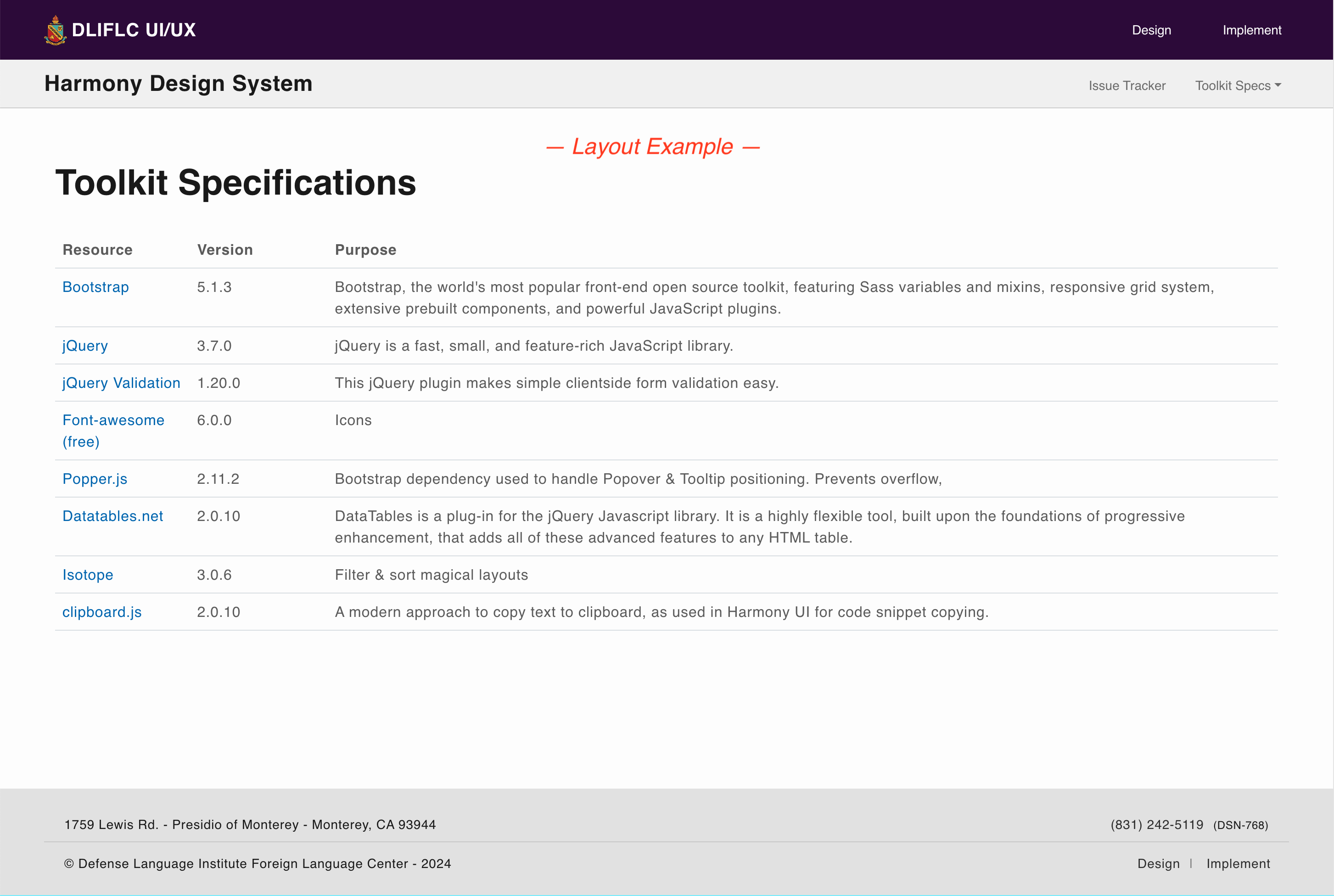
Basic Data-Tabletable.dataTable.dli-data-table (+ add this to on-page <script>: "jQuery('#Table-ID').DataTable();")
| DODID # | First | Last | |
|---|---|---|---|
| 816592 | Kiley | Ohl | kiley.ohl@dliflc.edu |
| 258917 | Jacob | Thornton | jacob.thornton@dliflc.edu |
| 657824 | Larry | Davis | larry.davis@dliflc.edu |
Small tabletable.table-sm.dli-data-table
| DODID # | First | Last | |
|---|---|---|---|
| 189284 | Kiley | Ohl | kiley.ohl@dliflc.edu |
| 258917 | Jacob | Thornton | jacob.thornton@dliflc.edu |
| 657824 | Larry | Davis | larry.davis@dliflc.edu |
Bordered tabletable.table-bordered
| DODID # | First | Last | |
|---|---|---|---|
| 189284 | Kiley | Ohl | kiley.ohl@dliflc.edu |
| 258917 | Jacob | Thornton | jacob.thornton@dliflc.edu |
| 657824 | Larry | Davis | larry.davis@dliflc.edu |
SM Bordered tabletable.table-sm.table-bordered
| DODID # | First | Last | |
|---|---|---|---|
| 189284 | Kiley | Ohl | kiley.ohl@dliflc.edu |
| 258917 | Jacob | Thornton | jacob.thornton@dliflc.edu |
| 657824 | Larry | Davis | larry.davis@dliflc.edu |
Color variants table(See class names below)
| Use case | Class Name to use on <tr> or <td> |
|---|---|
| Primary | (tr/td).table-primary |
| Alt | (tr/td).table-alt |
| Success | (tr/td).table-success |
| Danger | (tr/td).table-danger |
| Warning | (tr/td).table-warning |
| Info | (tr/td).table-info |
| Light | (tr/td).table-light |
| Dark | (tr/td).table-dark |
Responsive, horizontally scrollable tablediv.table-responsive > table
| # | Heading | Heading | Heading | Heading | Heading | Heading | Heading | Heading | Heading | Heading | Heading |
|---|---|---|---|---|---|---|---|---|---|---|---|
| 1 | Cell | Cell | Cell | Cell | Cell | Cell | Cell | Cell | Cell | Cell | Cell |
| 2 | Cell | Cell | Cell | Cell | Cell | Cell | Cell | Cell | Cell | Cell | Cell |
| 3 | Cell | Cell | Cell | Cell | Cell | Cell | Cell | Cell | Cell | Cell | Cell |
Notes about tables
- Combine class names for multiple style attributes to be applied. (ie: <table class="table-sm table-bordered"> would produce the table with reduced padding and the added external border around table).
- Table widths default to 100% of their parent.
- Responsive horizontal scrolling tables need to be wrapped in a "<div class="table-responsive">"
Functions and Interactions
<!-- Create a Data Table -->
	<table class="dli-data-table">
<!-- Create a Small Table -->
	<table class="table-sm">
<!-- Create a Bordered Table -->
	<table class="table-bordered">
<!-- Create a Responsive Table -->
	<div class="table-responsive">
		<table> ... </table>
	</div>
List Group
List groups are a flexible and powerful component for displaying a series of content. Modify and extend them to support just about any content within.
Examples
Basic List-group with optional active & disabled itemsul.list-group > li.list-group-item(.active)(.disabled)
- Active item
- Disabled item
- A third item
- A fourth item
- A fifth item
Actionable custom content list groupdiv.list-group > a.list-group-item(.list-group-item-action)
Use <a> or <button> to create actionable list group items with hover, disabled, and active states by adding .list-group-item-action.
List group item heading
3 days agoSome placeholder content in a paragraph.
And some small print.List group item heading
3 days agoSome placeholder content in a paragraph.
And some muted small print.List group item heading
3 days agoSome placeholder content in a paragraph.
And some muted small print.Functions and Interactions
<!-- Basic list group snippet -->
<ul class="list-group">
	<li class="list-group-item active" aria-current="true">Active item</li>
	<li class="list-group-item disabled" aria-disabled="true">Disabled item</li>
	<li class="list-group-item">A third item</li>
	<li class="list-group-item">A fourth item</li>
	<li class="list-group-item">A fifth item</li>
</ul>

<!-- Custom content list group snippet -->
<div class="list-group">
	<a href="#" class="list-group-item list-group-item-action active" aria-current="true">
	  <div class="d-flex w-100 justify-content-between">
		<h5 class="mb-1">List group item heading</h5>
		<small>3 days ago</small>
	  </div>
	  <p class="mb-1">Some placeholder content in a paragraph.</p>
	  <small>And some small print.</small>
	</a>
	<a href="#" class="list-group-item list-group-item-action">
	  <div class="d-flex w-100 justify-content-between">
		<h5 class="mb-1">List group item heading</h5>
		<small class="text-muted">3 days ago</small>
	  </div>
	  <p class="mb-1">Some placeholder content in a paragraph.</p>
	  <small class="text-muted">And some muted small print.</small>
	</a>
</div>
Badges
Badges are a multi-use component that is great for adding a 'count' to something or labeling. See some examples below.
Examples
Button with Badgebutton.btn > span.badge.{modifier classes for style as shown}
Large Primary Badge.badge .badge-primary / .badge-alt
Large Filled Badge.badge.badge-filled .badge-primary / .badge-alt
Badge Primary/Alt Compact.badge.badge-compact (optional .badge-filled) .badge-primary / .badge-alt (or color modifier)
Background Color Modifier Classes.badge.{modifier color classes as shown}
<span class="badge badge-primary">Large Badge</span>
<span class="badge badge-alt">Large Badge</span>
<span class="badge badge-filled badge-primary">Large Filled Primary Badge</span>
<span class="badge badge-filled badge-alt">Large Filled Alt Badge</span>
<span class="badge badge-primary badge-compact">Compact Primary</span>
<span class="badge badge-alt badge-compact">Compact Alt</span>

<button type="button" class="btn btn-primary">Notifications <span class="badge bg-light btn-badge text-dark">4</span></button>

<span class="badge bg-primary">.badge.bg-primary</span>
<span class="badge bg-light text-dark">.badge.bg-light.text-dark</span>
<span class="badge bg-success">.badge.bg-success</span>
<span class="badge bg-danger">.badge.bg-danger</span>
<span class="badge bg-warning text-dark">.badge.bg-warning.text-dark</span>
<span class="badge bg-info text-light">.badge.bg-info.text-light</span>
<span class="badge bg-dark">.badge.bg-dark</span>
Cards
Examples
Default Card.card
Small card with headings and button.card-sm
Functions and Interactions
<div class="card">
    <div class="card-body">
      <h5 class="card-title">Default card title</h5>
      <h2 class="mb-2">Card heading text</h2>
      <p class="card-text">Cards are great for content you want to draw attention to. Can be used with/without buttons, images, etc.</p>
      <hr>
      <a href="#" class="btn btn-primary">Confirm</a>
      <a href="#" class="btn btn-alt">Cancel</a>
    </div>
</div>
<div class="card-sm">
    <div class="card-body">
      <h5 class="card-title">Small card title</h5>
      <h2 class="mb-2">Small card heading text</h2>
      <p class="card-text">Small card version has same style & features as default card, but adds max-width of 480px. (Height has no maximum limit.)</p>
      <p class="card-text">The following data is for official use only, and is subject to PRIVACY ACT. Please confirm to proceed.</p>
      <hr>
      <a href="#" class="btn btn-primary">Confirm</a>
      <a href="#" class="btn btn-alt">Cancel</a>
    </div>
</div>
Tooltips
Tooltips are a great way to offer additional information to users, as they interact with UI elements. They are toggled on hover as well as sticking when focused until they lose focus.
Examples
Tooltip on link text with placement<a> (plus 'data-bs-' attributes shown below)
Placeholder text to demonstrate some inline links with tooltips.
Tooltip on button with placementbutton.btn (plus 'data-bs-' attributes shown below)
Tooltip with HTML.section-classname
Tooltip options and requirements
Must be initialized using .js (example below)
<script>

var tooltipTriggerList = [].slice.call(document.querySelectorAll('[data-bs-toggle="tooltip"]'))

var tooltipList = tooltipTriggerList.map(function (tooltipTriggerEl) {

	return new bootstrap.Tooltip(tooltipTriggerEl)

})

</script>
Mandatory
- data-bs-toggle="tooltip"
- data-bs-title="[your title (& optional HTML)]"
Optional
- data-bs-html="true" - (Mandatory if using HTML)
- data-bs-placement="[top (default)/right/bottom/left]"
Functions and Interactions
<!-- Initialize script to activate tooltips -->
<script>

	var tooltipTriggerList = [].slice.call(document.querySelectorAll('[data-bs-toggle="tooltip"]'))

	var tooltipList = tooltipTriggerList.map(function (tooltipTriggerEl) {

		return new bootstrap.Tooltip(tooltipTriggerEl)

	})

</script>

<!-- Tooltip on text link -->
<p>Placeholder text to demonstrate some <a href="#" data-bs-toggle="tooltip" data-bs-title="Default tooltip" data-bs-placement="top">inline links</a> with tooltips.</p>

<!-- Tooltip on button -->
<button type="button" class="btn btn-alt" data-bs-toggle="tooltip" data-bs-placement="top" title="Tooltip on top">
	Tooltip on top
</button>
<button type="button" class="btn btn-alt" data-bs-toggle="tooltip" data-bs-placement="right" title="Tooltip on right">
	Tooltip on right
</button>
<button type="button" class="btn btn-alt" data-bs-toggle="tooltip" data-bs-placement="bottom" title="Tooltip on bottom">
	Tooltip on bottom
</button>
<button type="button" class="btn btn-alt" data-bs-toggle="tooltip" data-bs-placement="left" title="Tooltip on left">
	Tooltip on left
</button>

<!-- Tooltip on button with HTML -->
<button type="button" class="btn btn-alt" data-bs-toggle="tooltip" data-bs-html="true" title="<em>Tooltip</em> <u>with</u> <b>HTML</b>">
	Tooltip with HTML
</button>
Popovers
Examples
Popover on a.btn-linkbutton.btn (plus 'data-bs-' attributes shown below)
Styled Bootstrap Popoverbutton.btn (plus 'data-bs-' attributes shown below)
Dismissable Popover.section-classname
Popover options and requirements
Must initialize using .js (example below)
<script>

var popoverTriggerList = [].slice.call(document.querySelectorAll('[data-bs-toggle="popover"]'))

var popoverList = popoverTriggerList.map(function (popoverTriggerEl) {

	return new bootstrap.Popover(popoverTriggerEl)

})

</script>
Mandatory
- data-bs-toggle="popover"
- data-bs-content="[your content]"
Optional
- data-bs-title="[your title]"
- data-bs-placement="[top (default)/right/bottom/left]"
- data-bs-trigger="focus" (else default is toggled on/off by clicking object)
Functions and Interactions
<!-- Initialize script to activate popovers -->
<script>

	var popoverTriggerList = [].slice.call(document.querySelectorAll('[data-bs-toggle="popover"]'))

	var popoverList = popoverTriggerList.map(function (popoverTriggerEl) {

		return new bootstrap.Popover(popoverTriggerEl)

	})

</script>

<!-- Button Link Example -->
Using a <a tabindex="0" class="btn-link" role="button" data-bs-toggle="popover" data-bs-trigger="focus" title="[Popover title]" data-bs-content="[Popover content]">button link</a> as a popover.

<!-- Toggleable Popover on Button -->
<button type="button" class="btn btn-lg btn-primary" data-bs-toggle="popover" data-bs-placement="bottom" data-bs-content="[Popover content]" popover-link="#">Click to toggle popover</button>

<!-- Dismissable Popover on Button -->
<a tabindex="0" class="btn btn-lg btn-primary" role="button" data-bs-toggle="popover" data-bs-trigger="focus" title="[Popover title]" data-bs-content="[Popover content]">Dismissible popover</a>
Close/Dismiss
Examples
Default close/dismiss buttonbutton.btn-close
Disabled close/dismiss buttonbutton.btn-close:disabled
On dark background close/dismiss buttonbutton.btn-close.btn-close-white
Functions and Interactions
<!-- Default -->
<button type="button" class="btn-close" aria-label="Close"></button>
<!-- Disabled -->
<button type="button" class="btn-close" disabled aria-label="Close"></button>
<!-- Dark BG -->
<button type="button" class="btn-close btn-close-white" aria-label="Close"></button>
Collapse
Examples
Text link with hrefa.btn-link (href="#targetId" data-bs-toggle="collapse" role="button")
Button with 'data-' attributebutton.btn.btn-primary (href="#targetId" data-bs-toggle="collapse")
Accessibility
- DO usearia-expanded="(true/false)" on control element.
(If default expanded, use true. If default collapsed, use false.) - If control is NOT <button> (ie: <a>, etc.), addrole="button"
- DO use aria-controls="collapseContainerID" to convey relationship to assistive technologies.
Read more about implementing accessibility for this component.
Functions and Interactions
<!-- Text link example -->
<a class="btn-link collapsed" href="#collapseExample-BtnLink" data-bs-toggle="collapse" role="button" aria-expanded="false" aria-controls="collapseExample-BtnLink">
	Link with href
</a>
<div class="collapse mt-3" id="collapseExample-BtnLink">
	<div class="card card-body">
		Some placeholder content for the collapse component. This panel is hidden by default but revealed when the user activates the relevant trigger.
	</div>
</div>

<!-- Button example -->
<button class="btn btn-primary" type="button" data-bs-toggle="collapse" data-bs-target="#collapseExample-Btn" aria-expanded="false" aria-controls="collapseExample-Btn">
	Collapse Button
</button>
<div class="collapse mt-3" id="collapseExample-Btn">
	<div class="card card-body">
	Some placeholder content for the collapse component. This panel is hidden by default but revealed when the user activates the relevant trigger.
	</div>
</div>
Progress
Examples
Progress Barsdiv.progressLabel ~ div.progress > div.progress-bar
Functions and Interactions
<!-- Bootstrap HTML -->
<div class="progressLabel" translate [translateParams]="(Parameters)">Label Name</div>
<div class="progress">
    <div class="progress-bar" role="progressbar" style="width: 25%;" aria-valuenow="25" aria-valuemin="0" aria-valuemax="100"></div>
</div>
Pagination
Examples
Default paginationul.pagination > li.page-item > a.page-link
Pagination with disabled & active states
ul.pagination > li.page-item.[active/disabled] > a.page-link
Functions and Interactions
<nav aria-label="...">
	<ul class="pagination justify-content-center">
		<li class="page-item disabled">
			<a class="page-link">Previous</a>
		</li>
		<li class="page-item"><a class="page-link" href="#">1</a></li>
		<li class="page-item active" aria-current="page">
			<a class="page-link" href="#">2</a>
		</li>
		<li class="page-item"><a class="page-link" href="#">3</a></li>
		<li class="page-item">
			<a class="page-link" href="#">Next</a>
		</li>
	</ul>
</nav>
Spinners
Examples
Border Spinners.classes
Growing Spinners.classes
Button Spinners.classes
Functions and Interactions